Floris
Project
Brand Idenity design, Packaging Design and Website Development
Overview
Floris is a premium lifestyle brand positioned at the intersection of elegance, simplicity, and modern consumer expectations. The project scope covered end-to-end brand identity design, website UX/UI design, and packaging system development.
Scope:
- Brand Identity Design
- Website Design (UX/UI)
- Packaging Design
Objective: To create a cohesive, scalable, and premium brand experience that resonates across physical and digital touchpoints while positioning Floris competitively in its market.
Brand Identity Design
The brand identity was developed through an iterative design process that moved from exploration to refinement. Initial concepts focused on multiple creative directions, testing variations in typography, spacing, and visual balance to determine the strongest expression of the brand. These directions were evaluated against the strategic goals to ensure alignment between aesthetics and positioning.
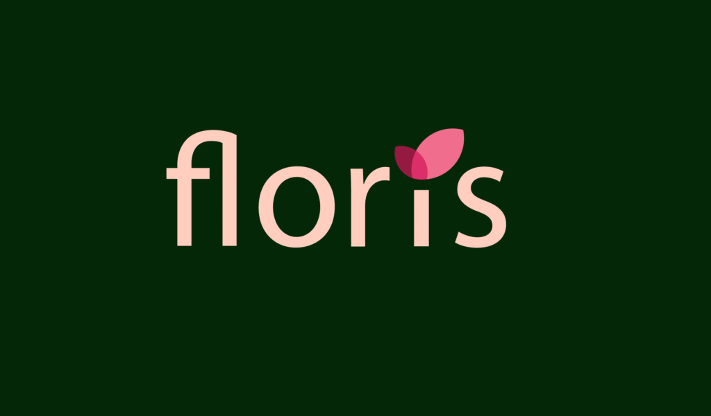
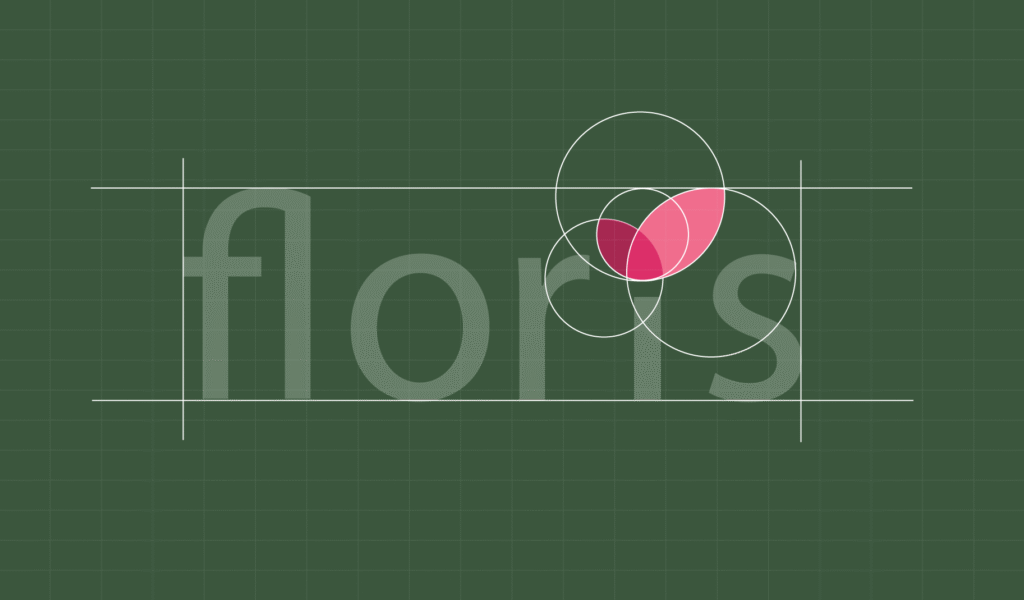
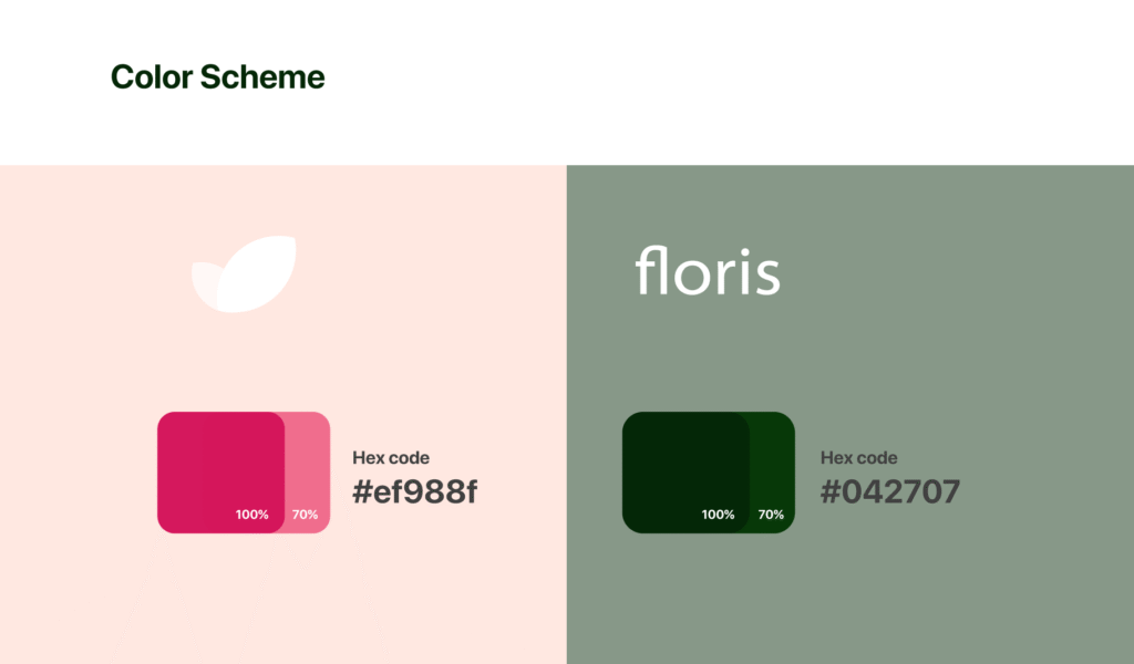
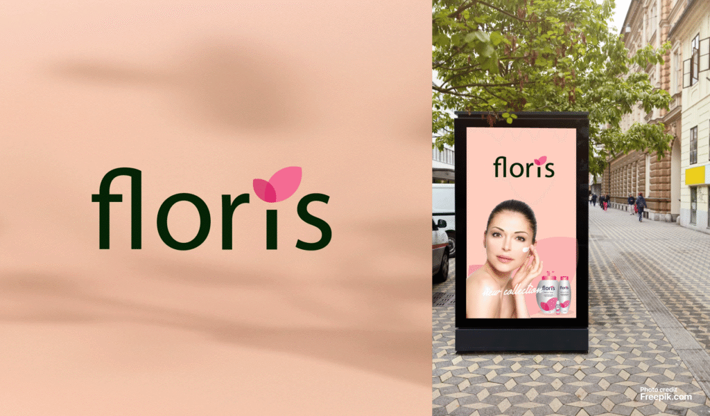
The final identity was built around the principles of simplicity and refinement, using clean geometry and balanced typography to establish a timeless visual language. The logo was designed as a minimal yet strong wordmark with high versatility across digital and print applications. The color palette combined neutral base tones to convey sophistication with subtle accents to highlight key elements. Typography paired an elegant serif with a modern sans-serif to create a clear hierarchy and a refined tone of voice.
To ensure usability and scalability, a comprehensive set of brand guidelines was created, covering logo usage, spacing, color application, and typography rules. Supporting assets such as iconography, visual guidelines, and social media direction were developed to ensure consistency across all brand applications, resulting in a cohesive and scalable identity system. The brand identity was developed around the principles of simplicity and refinement, using clean geometry and balanced typography to establish a timeless visual language. The logo was designed as a minimal yet strong wordmark with high versatility across digital and print applications. The color palette combined neutral base tones to convey sophistication with subtle accents to highlight key elements. Typography paired an elegant serif with a modern sans-serif to create a clear hierarchy and a refined tone of voice. Supporting assets such as iconography, visual guidelines, and social media direction were developed to ensure consistency across all brand applications, resulting in a cohesive and scalable identity system.
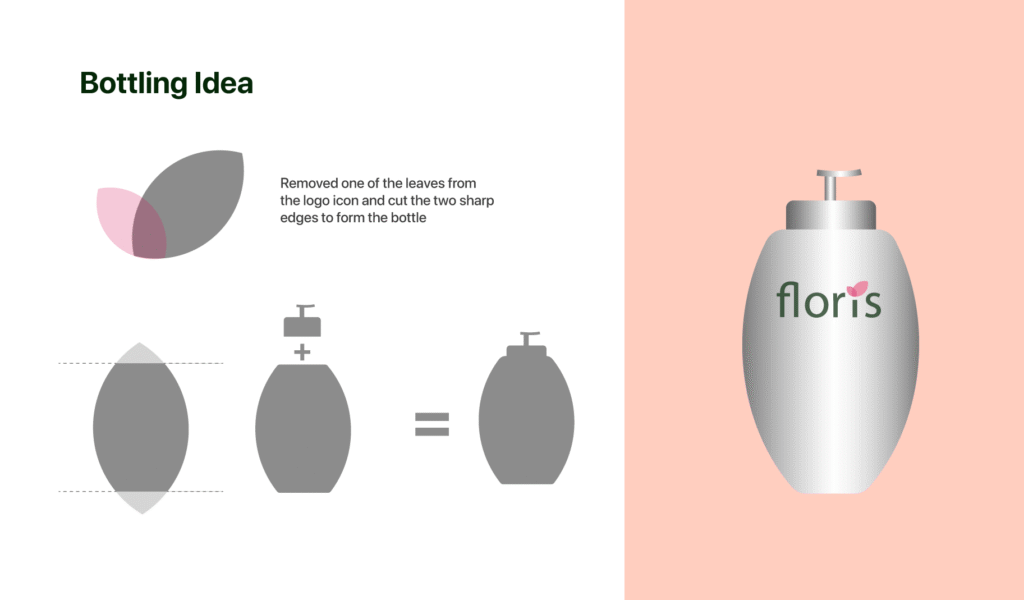
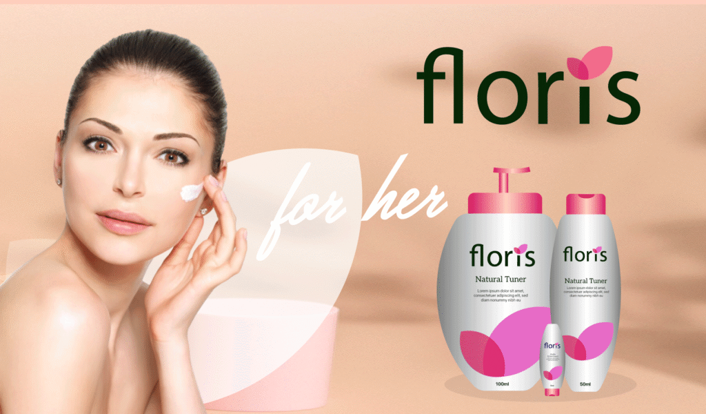
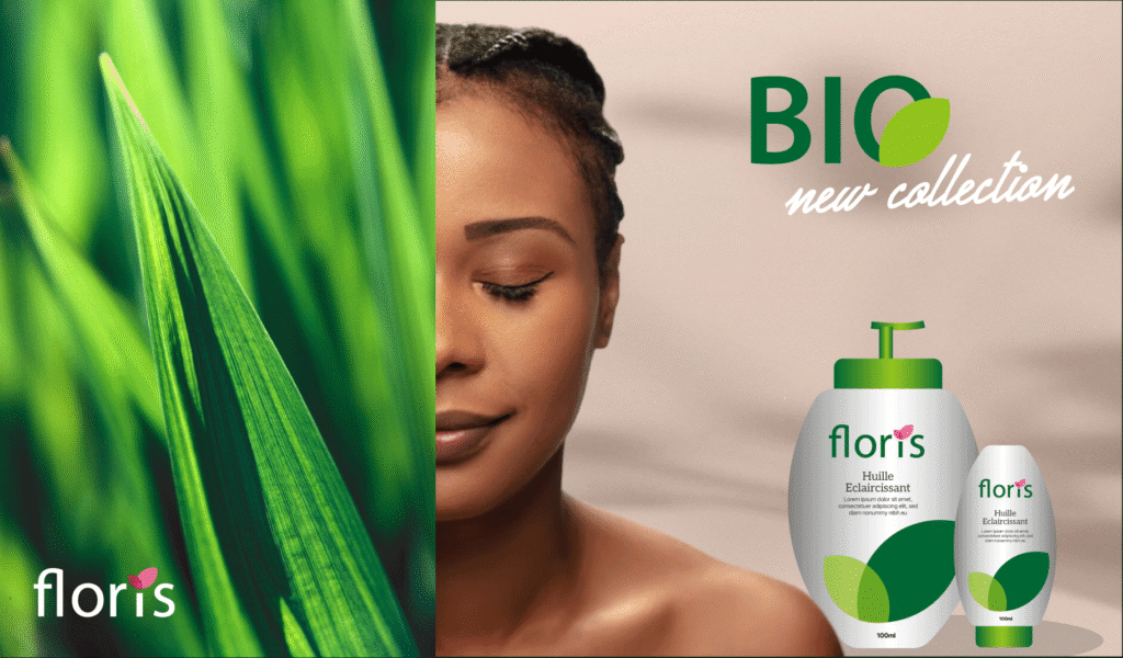
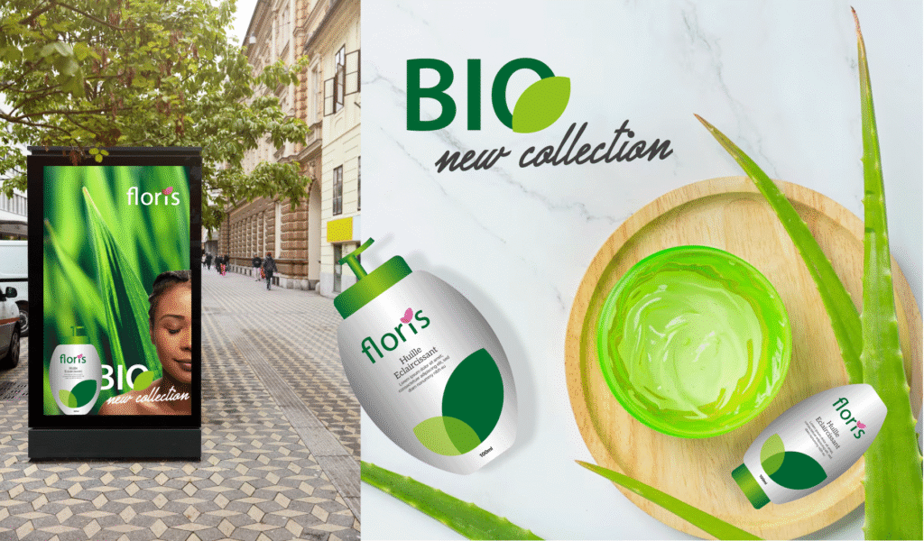
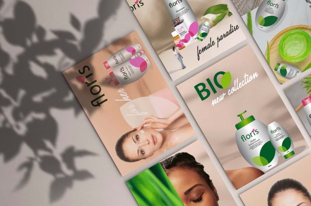
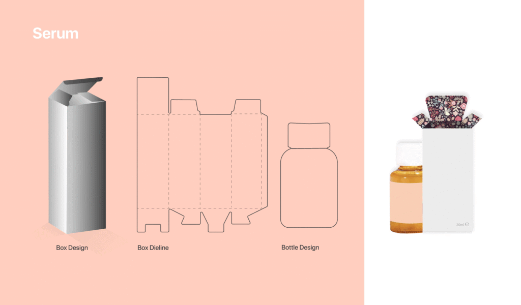
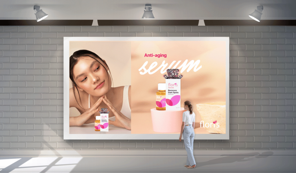
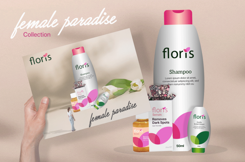
The packaging design process began with understanding the product experience and the role packaging plays in shaping customer perception. Concepts were explored with a focus on how the product would be received, opened, and experienced physically, ensuring that the unboxing moment aligned with the brand’s premium identity.
Design explorations tested different layout structures, typographic treatments, and material directions to find the optimal balance between minimalism and visual impact. The final approach emphasized clarity, strong typography, and a restrained use of color to maintain elegance.
Production considerations were integrated into the process, including material recommendations, print techniques, and scalability for future product variations. Deliverables included packaging concepts, a label design system, and print-ready files, resulting in a packaging experience that enhances perceived value and reinforces the brand consistently across all physical touchpoints. The packaging system was developed to elevate perceived product value and create a memorable unboxing experience while maintaining strict alignment with the brand identity. The design approach focused on minimalism, strong typography, and a consistent visual language across all packaging elements. Consideration was given to material selection and print finishes to enhance the premium feel. Deliverables included packaging concepts, a label design system, and print-ready production files, resulting in packaging that reinforces the brand at every physical touchpoint.

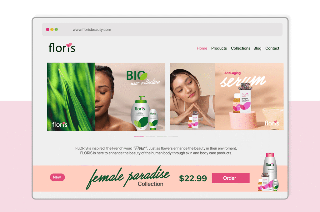
The website design process followed a structured UX methodology, starting with defining the information architecture and mapping key user journeys. This included identifying primary user goals, structuring content hierarchies, and simplifying navigation to reduce friction. Wireframes were developed to validate layout decisions and ensure logical flow before moving into high-fidelity design.
The UI phase translated the brand identity into a digital interface, focusing on clean layouts, strong visual hierarchy, and the strategic use of whitespace to reinforce a premium feel. Components were designed systematically to ensure consistency and scalability, forming the foundation of a reusable design system within Figma.
Special attention was given to conversion principles, including clear call-to-actions, visual emphasis on key sections, and a guided user flow from landing to purchase or inquiry. Responsiveness was a core consideration throughout the process, ensuring seamless performance across mobile, tablet, and desktop devices.
The final result is a refined, mobile-first website that balances aesthetics with functionality, delivering a seamless and high-performing user experience aligned with the brand’s premium positioning.
Design System & Consistency
A unified design system was implemented to ensure consistency and scalability across all outputs. This system defined grid structures, spacing rules, typography scales, and color usage guidelines, allowing Floris to maintain a coherent identity as it grows and expands into new products or platforms.
Results & Impact
The project resulted in a strong and recognizable brand identity that enhances perceived product value and delivers a cohesive experience across digital and physical channels. The combination of strategic positioning, refined design execution, and system-based thinking provides Floris with a scalable foundation for long-term growth.
Feedback
This project highlights the importance of consistency across touchpoints in building trust and recognition, demonstrates how minimalism can elevate perceived value when executed with precision, and reinforces the role of a well-structured design system in enabling scalability and efficiency.